The e-commerce market is positioned to grow with new tech arrivals, while traditional brick-and-mortar chains face challenges as digitalisation grows.
E-commerce sales are projected to reach $6.333 billion by 2024. Forecasts suggest that this amount will increase by 39 percent in the coming years, exceeding 8 trillion dollars by 2027. This expansion can benefit e-commerce retailers (and designers) who adhere to e-commerce UX design principles and pay close attention to the UX/UI.
By prioritising UX and following a uniform set of e-commerce UX design principles for the customer purchasing flow, e-commerce retailers (and designers) can gain a competitive edge and achieve high financial gains.
When adequately executed, the shopping flow, a general user journey, increases overall conversion, decreases cart abandonment, and boosts impulse purchases.
The components of the user journey are: –
- Website discovery
- Product page
- Product Search/browse
- Checkout
- Shopping Cart
- Order confirmation
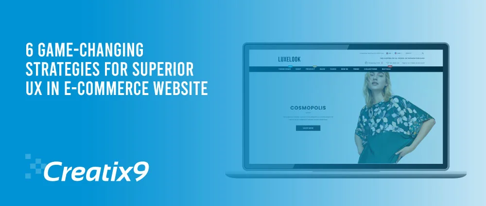
This article discusses the major aspects of the user buying experience moments and how e-commerce designers can ensure a pleasant, easy, and trouble-free experience for the consumer during e-commerce website development in the UK.
1. Website Discovery
Clearly position the brand
Visitors form initial impressions of a website in as little as 50 milliseconds. During e-commerce website development, developers and designers must captivate the user’s interest by clearly and concisely displaying the products and their position in the market.
For instance, the website of a luxury jewelry retailer would have a completely different appearance and feel than that of a discount big-box retailer. The upscale electronics retailer Bang & Olufsen establishes its brand image by employing sophisticated colour schemes, elegant typefaces, and sleek product images.
Display Appropriate Calls to Action
Upon accessing the homepage, welcome the user with pertinent information and precise prompts for action (CTAs).
A big picture on a website that matches the current season or a special event, along with a clear call-to-action (CTA) button, helps users move forward with their shopping. Avoid including generic phrases such as “get started” in your CTAs that fail to inform the user of what to expect next.
Polaroid, an electronic firm’s compelling call to action, involved assisting users in purchasing gifts during the holiday season. By substituting the generalised phrase “Get 10% off!” with “Shop,” Polaroid explicitly directed the user to a website section containing gift recommendations.
Landing page customisation for SEO
E-commerce retailers can appeal to users actively seeking a particular product by associating their search terms from search engines such as Google with targeted landing pages.
When a user searches, they may intend to purchase the item in question. During e-commerce website development, designers or developers can build a specialised landing page tailored to frequently searched product terms. An online merchant can thus enhance the likelihood of successfully closing a sale and potentially acquiring a new customer.
A stationery firm called Papier successfully accomplishes this with a Google search results page explicitly designed for wedding invitations.
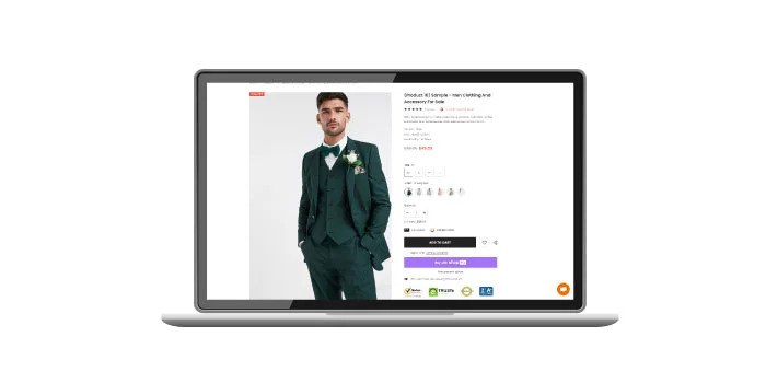
2. Product Page
Conspicuously exhibit primary actions
Never should a user be confused about how to perform a critical action, such as adding an item to their purchasing cart. When performing e-commerce website development tasks, place icons representing primary actions such as “buy now” or “add to cart” in a prominent location on the screen compared to the remaining content.
Lowe’s, a retailer of home improvement products, prominently displays a large green icon that instructs users on how to add items to their carts.
Offer Comprehensive Product Information
Illustrate the product with professional, high-quality images and thorough descriptions to aid purchasers in comprehension.
Implement visual hierarchy and progressive disclosure to provide the user with the necessary information. First, provide users with the most essential information, then supplement the page with additional details for those who wish to learn more.
Such sections may include an overview, dimensions and measurements, specific features, and shipping details. Myprotein employs expand/collapse navigation to facilitate access to additional sections and mitigate user fatigue.
Establish Client Trust
Prevent consumers from being in the dark regarding return policies, product availability, and shipping alternatives. Ensuring that this information is easily accessible fosters customer confidence and trust, potentially persuading a hesitant customer to proceed with a purchase. A greater understanding of whether and how to return an item enables them to make more informed choices.
ASOS effectively presents critical shipping and return details on every product page by utilising a modal that can be accessed via a hyperlink beneath the respective product name.
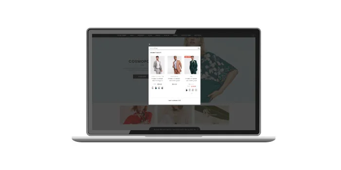
Go for Social Proof
The idea of “social proof” states that people are affected by how others act. Dr. Robert Cialdini, a top researcher in the science of influence, developed this idea, which has been shown to work.
E-commerce merchants can utilise social proof to increase consumer trust by including customer ratings, reviews, and comments. Frequently, thousands of customers have rated products on Amazon, and they can be sorted by star rating.
3. Product Search/Browse
Implement an On-Site Search
Even though it may appear quite elementary, many developers or designers still do not work on a site-wide search when working on an e-commerce website development project, or if they do, it is not optimised adequately. However, site enquiry is an essential component of a successful e-commerce transaction.
As per Invesp, 60% of electronic buying are not reckless. Individuals frequently clearly understand their desired product or model number; therefore, entering that information into a search bar on an e-commerce website is considerably more efficient than navigating through menu choices.
Additional functions such as predictive search and autocomplete help users rapidly locate options. Apple employs this strategy by incorporating dynamically updated search fields that provide quick links to products and popular suggested queries.
Motivate Visitors while in Discovery Mode
Although many customers enter a store with a particular product in mind, not all visitors share this certainty. Nielsen Norman classifies e-commerce consumers into five distinct categories, one of which is the “browser.” Users are not inherently seeking a particular content or service. Instead, they are idly perusing their surroundings in search of anything intriguing.
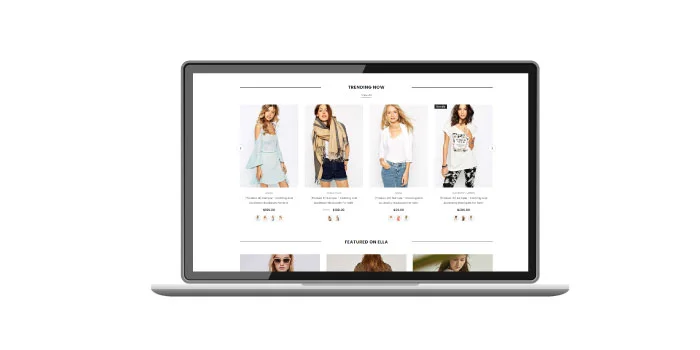
In discovery mode, e-commerce websites can assist the customer by displaying new or best-selling products and facilitating fast access to product categories.
Etsy actively involves browsers by prominently featuring current trends and clearly delineating overarching product categories in the navigation and homepage content.
Implement Faceted and Filtered Search
In addition to applying filtering, faceted search lets users select multiple attributes together.
During e-commerce website development, instead of restricting filter options to broad criteria such as price, size, or colour, incorporate category-specific filters that pertain to the products under consideration.
Instances of such limitations is garment fit or fabric considerations, device screen size or processor specifications, garment fit or fabric specifications and invitation fonts or occasions.
Make sure it’s obvious on the website when someone applies a filter. Also, it should be simple for the user to remove applied filters.
ASOS provides a comprehensive selection of filters for each category, with the filters that have been applied indicated.
4. Checkout
User Checkout Permit as Guests
Almost forty percent of the money spent on e-commerce is on impulse purchases. Buyers can bypass the additional step of creating an account or logging in by proceeding with the checkout process as visitors. You can create an easy integration during e-commerce website development so visitors can quickly create an account during checkout. In this way, you can convert some guests into registered users.
Aesop is an Australian luxury cosmetics brand that allows users to check out as visitors in addition to the choice to log in or register. Including multiple options in a single form eliminates potential purchase barriers for users desiring a fast checkout experience. This approach also grants users the opportunity to register for the service.
Deliver Visual Input throughout the Checkout Procedure
Implementing a progress bar facilitates client comprehension of their current checkout status and the remaining tasks that need to be done.
Apple visualises each process phase and facilitates user navigation through progress links. The user’s progress is preserved, ensuring no work is lost during the transition between stages.
Employ Standard Payment Methods
Adding popular payment methods such as PayPal and accepting major credit cards could increase conversion rates for customers who prefer not to provide credit card information.
In the Netherlands, iDEAL is often used for online shopping; 60% of Dutch people have recently bought something utilising this mode. Buyers can complete purchases at clothing retailer Scotch & Soda using iDEAL and PayPal.
5. Shopping Cart
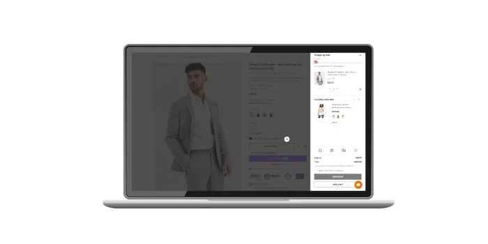
Present a concise order summary
Provide the consumer with a concise and clear-cut order summary prior to completing their purchase. This summary should disclose the quantity and price of each item and the overall order amount. Users can modify any items they wish to delete or update and provide a shipping summary to prevent unexpected shipping charges.
The Modist presents both a receipt and a concise order summary. The user can quickly and easily manage selected items (move to wishlist, delete, modify quantity) and view a comprehensive shipping and tax charges breakdown.
6. Order Confirmation
Present an In-Depth Order Confirmation Following a Purchase
Upon completing the transaction, confirm with the customer that the payment was successfully processed and provide the delivery details (including the address, method, and anticipated delivery date).
The Amazon confirmation email functions as follows: it presents the order number, an inventory of the purchased items, the date of shipment, and suggestions for subsequent purchases.
Deliver Shipping and Order Updates via Email
A confirmation email, along with the confirmation interface, updates the user regarding the progress of their purchase. Although email confirmation should be sent to all customers, it is beneficial for individuals who have previously checked out as guests and lack a website account to access their previous orders.
Provide an update if the order undergoes any alterations, such as a delivery delay. Upon shipment, provide an email update containing the item’s tracking number.
Summary
Although the principles outlined in this article serve as a foundation for the user journey touchpoints that all e-commerce designers should adhere to when developing an e-commerce website, they are merely the start.
The expanding e-commerce industry provides retailers with numerous prospects. Organisations that prioritise user experience (UX) and adhere to optimal strategies for the e-commerce user journey can sustain competitiveness and generate favourable financial results.
Call Creatix9, a digital agency in the UK, for your app, website, branding, or digital marketing needs. From e-commerce website development to e-commerce logo design, we can be a game-changer in making your e-commerce business stand out. Call us now.